
Best Filter Image Gallery | Responsive Filter Gallery – AK Web Edits
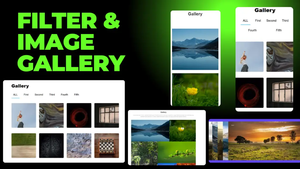
Best Filter Image Gallery – aK Web Edits Filter Image Gallery | Responsive Image Gallery us HTML & CSS – AK Web Edits Welcome to this blog of AK Web Edits. This blog is about the Image Gallery on Websites which are filter or normal. Creating an image gallery for a website can greatly enhance the user experience by allowing visitors to view images in a visually appealing and interactive manner. You can implement an image gallery using a combination of HTML, CSS, and JavaScript. Below is a guide to building a basic yet functional image gallery for a website. Steps to Create an Image Gallery: HTML: Structure the gallery with HTML elements like div containers, img tags, and buttons for navigation. CSS: Style the gallery, ensuring it looks clean and responsive on different screen sizes. JavaScript: Add interactivity, such as the ability to click an image to view it in full size or add filtering functionality. A filter image gallery is a type of visual gallery or collection where images can be filtered based on certain criteria, allowing users to view specific subsets of images according to their preferences or needs. This is commonly used in websites, apps, and other platforms where a large number of images are displayed. Key Components of a Filter Image Gallery: Images: The gallery itself contains a collection of images, which could be photographs, illustrations, or any type of visual media. Filtering Options: These are the criteria by which users can filter the displayed images. Some common types of filters include: Categories: Images can be grouped into categories such as nature, portraits, architecture, etc. Tags: Images can be tagged with keywords that describe their content or characteristics (e.g., “sunset,” “beach,” “black and white”). Date: Filters can be applied based on when the image was uploaded or taken (e.g., images from the past week, month, or year). Size or Resolution: Filters can sort images based on size (small, medium, large) or resolution (low, high). Color: Some galleries allow filtering by dominant colors in the image. Popularity/Rating: Images can be filtered based on user ratings, likes, or views. Search: Users can search for specific terms to find related images. User Interface (UI): The filtering options are typically presented as dropdown menus, checkboxes, sliders, or buttons. Some galleries also offer a search bar where users can type keywords to narrow down the image selection. Responsive Design: In modern galleries, filters are often designed to be dynamic, meaning the images update in real-time as the user selects or deselects filters. https://www.youtube.com/watch?v=3DEJoJy1O3Y How It Works: When users visit an image gallery, all or some of the images are displayed. Users can apply one or more filters, and the gallery updates to show only images that match the selected criteria. This helps users to quickly find the images they are most interested in without having to sift through the entire collection. Example: Imagine a photography website where users can view different types of photos. The filter options might include: Categories: “Nature,” “Urban,” “Animals” Tags: “Sunset,” “Forest,” “Waterfall” Date: “Uploaded in the last month” Resolution: “High resolution” By selecting “Nature” and “Sunset,” the gallery would only show images of sunsets in nature, making it easier to find the specific type of image the user is looking for. Benefits of Filter Image Galleries: Improved user experience: Users can quickly find images that match their preferences. Organization: Large galleries can be easily managed and navigated. Customizability: Users can personalize their experience by applying different filter criteria. Efficiency: Reduces the time spent searching for specific images, especially in large collections. Thanking you, Amit Kumawat Developer of AK Web Edits
Best Filter Image Gallery | Responsive Filter Gallery – AK Web Edits Read More »